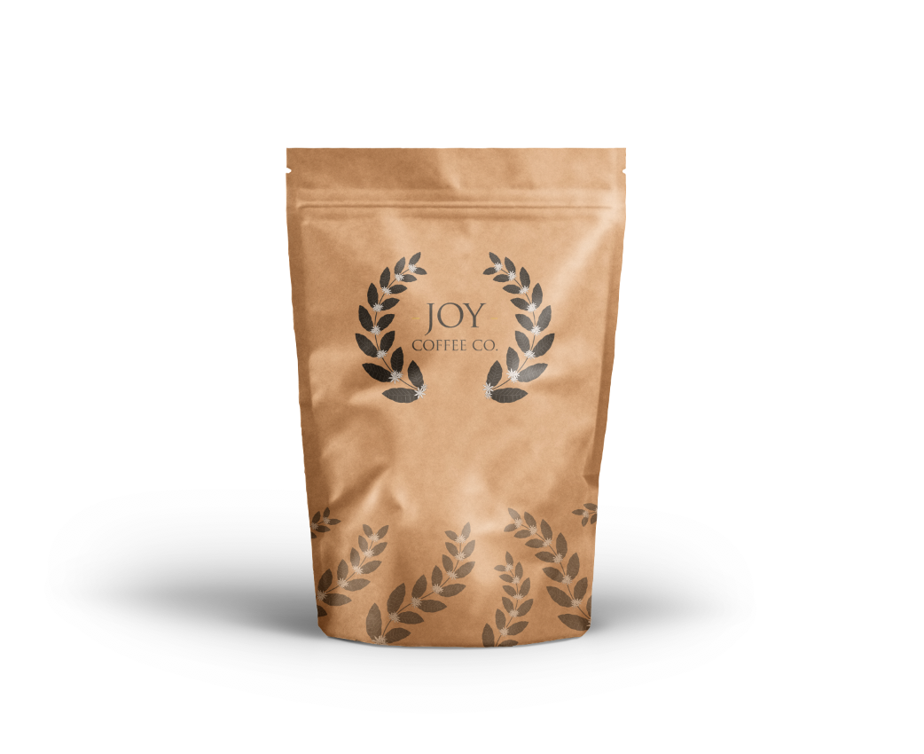
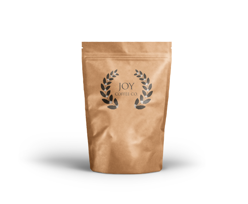
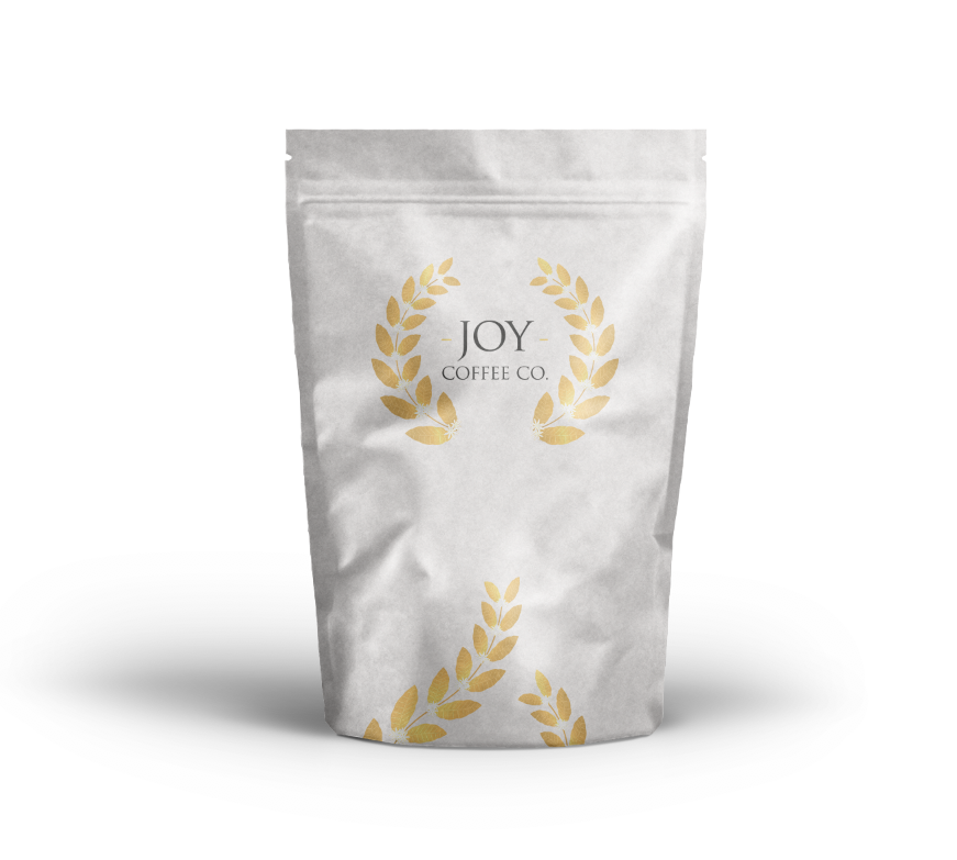
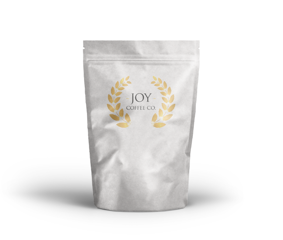
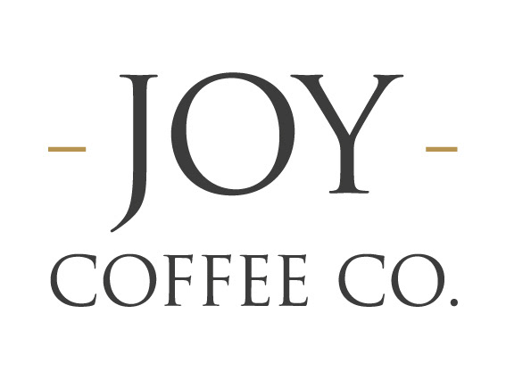
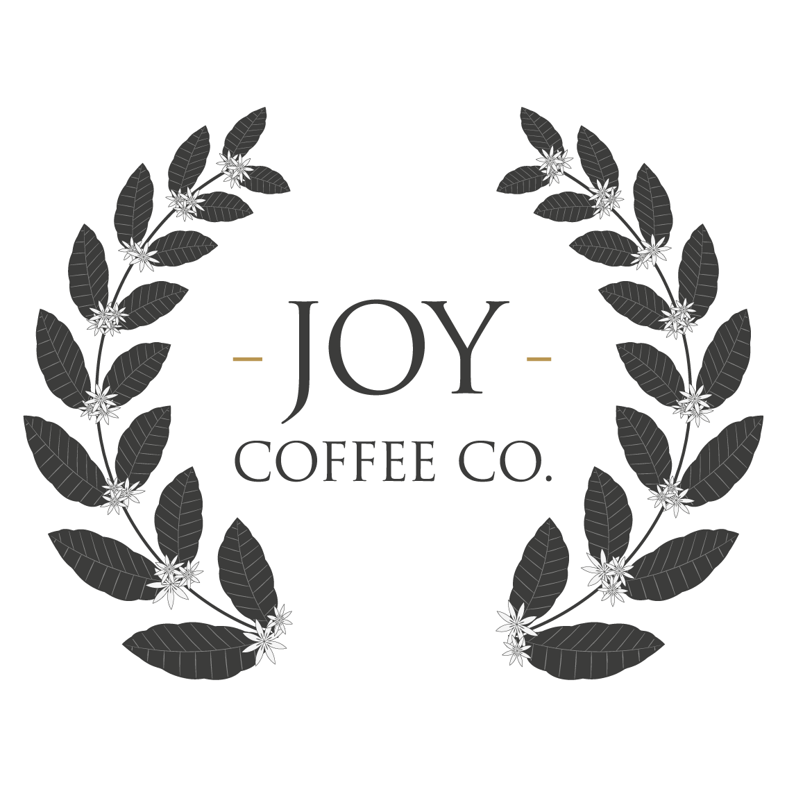
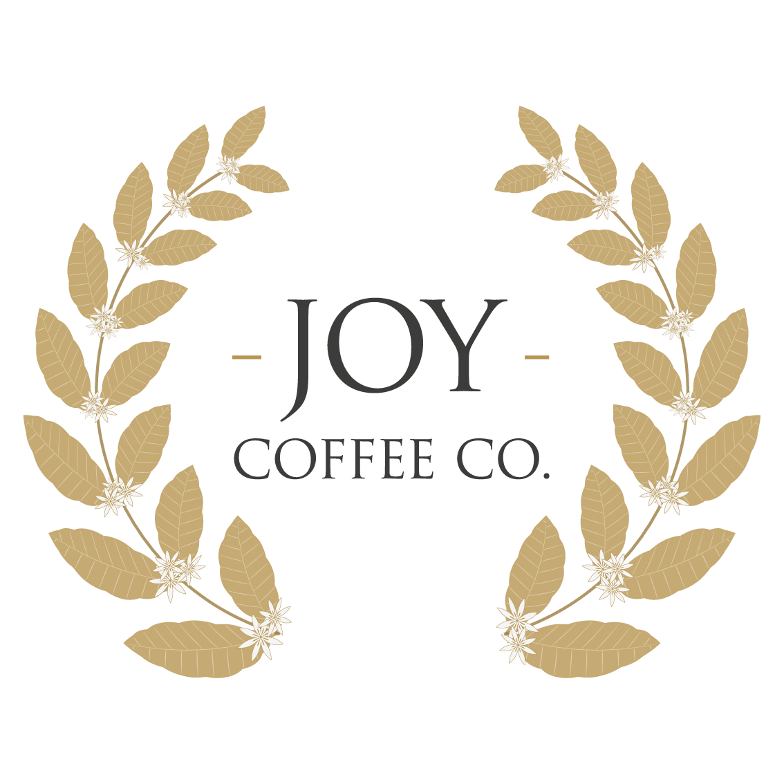
Branding for a small, mobile artisan coffee business operating around the city of Lincoln. The primary brand idea utilised a simplistic representation of the arabica coffee plant in a traditional laurel style logo form centered around a strong logotype.

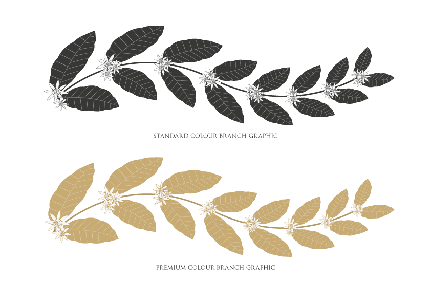
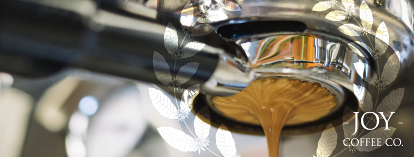
Assets could then be used throughout supporting imagery to strengthen brand recognition and build familiarity. Two main colourways were developed, with the grey colourway as the primary and the gold for more premium products.
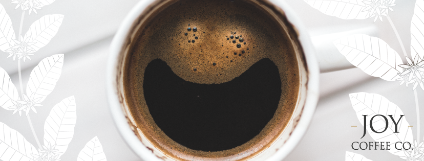
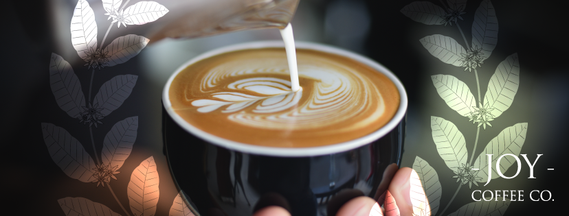
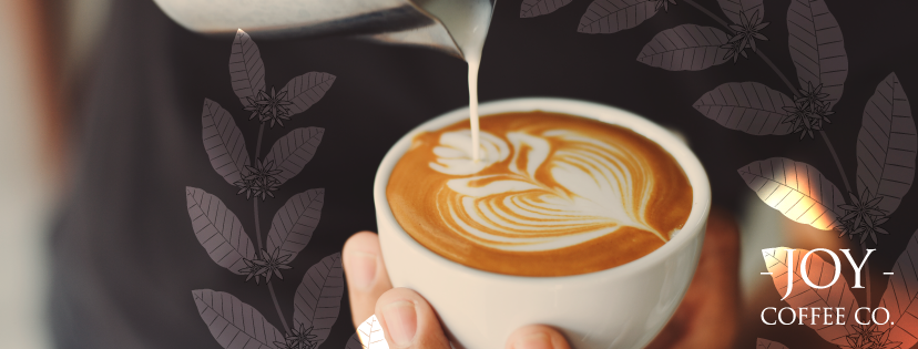
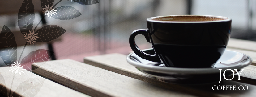
Execution examples using supporting imagery

Example product packaging